The exhibition was in the drawings galleries reserved for exhibitions. These are three good sized rooms which are, for most drawings shows, hung cheek by jowl leaving no breathing room. In this case, however, since there are only about 40 works everything has some space, but the rooms certainly do not look empty. It makes the exhibition more relaxing to look at. You do not feel rushed to see it all but can savor each wonderful picture.
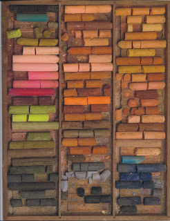
The show is curated by two Met staffers, Katherine Baetjer, Curator of European Paintings and her collaborator Marjorie Shelley, Sherman Fairchild Conservator in Charge, Paper Conservation. Marjorie has always had a special interest in pastels and has started a collection within her department of artists’ materials as well. Up front we get an explanation of the medium illustrated by an actual artists work table which has spaces for pastels as well as brushes and watercolors. We also find drawers of pastels arranged by color with every hue, far surpassing the colors offered in MS Word. The medium became extremely popular in Europe during the 18th century with some 2,500 artists employing pastels by 1750.
I tend to look at portraits similarly to snap shots that our friends and relatives have taken. I begin to feel if I have seen one I have seen them all - not another one of Aunt Minnie on the beach, please. When it comes to art I want to see another dimension. I want it to grab me. Style and quality are all important and sometimes the name of the sitter can illuminate the piece. Pastel is an excellent medium for showing the expressions of it’s sitters and also for showing such vanities as the powder coming off of their wigs or the lace of their frocks.
Going around the exhibition, my wife or I would say “oh, I love that one” but the other would then disagree and love something else. That, for me, is the sign of a good exhibition when different people can enjoy different works and then agree on a few that we both think are great or we both dislike.
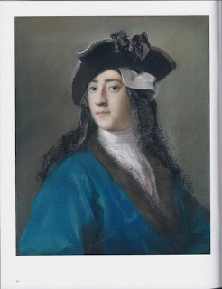
One that we could agree on is by Rosalba Carriera (Venice 1673 – Venice 1757) of Gustavus Hamilton 2nd Viscount Boyne, in Masquerade Costume. Part of the Met’s collection it is not the cover picture of the catalog but it is the featured work on their website. The picture was probably created at the 1730 or 1731 Carnival in Venice and who doesn’t want to remember themselves in costume. Penelope and I have such a photo of ourselves and had it reproduced on a postage stamp, which we used for our 35th anniversary invitation.
Charles Antoine Coypel (Paris 1694 - Paris1752) was clearly a master in this medium and the exhibition has three examples. As I am writing this I remember that we have a portrait in oil of Charles de Rohan, Prince de Montauban also by Charles Antoine Coypel. If you compare it to one belonging to the Metropolitan, a double portrait presumed to represent François de Jullienne and his wife in 1743, though one can plainly see the similarity in the style, the pastel gives the sitter a more ethereal and less realistic look while the oil is more solid and down to earth.
The exhibition challenges the preconceptions we have about pastel. It surprises us with the range of effects the artists created with the medium, from the meticulously detailed laces and brocades of the aristocratic double portrait by Coypel illustrated above, to the spontaneity achieved by free strokes of Greuze in the Frick’s portrait of the actor Baptiste Aîné. I guess you will just have to see that one for yourselves!

No comments:
Post a Comment